
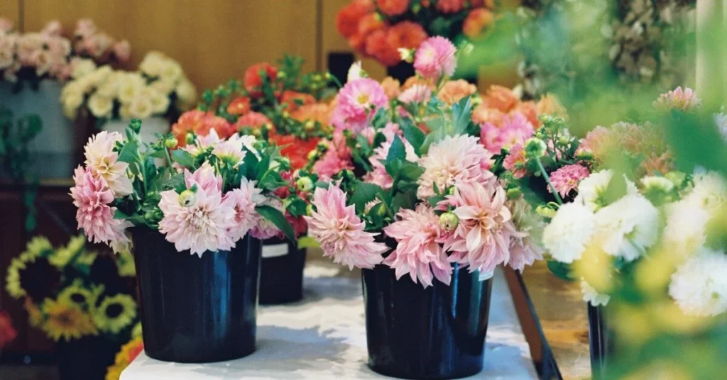
How to Pot Artificial Flowers: 7 Easy Styling Methods That Look Premium, Not Cheap?
Cheap-looking faux flowers in pots usually fail before styling starts. The wrong pot, weak base, flat shape, and shiny stems make the whole display look false.
To make faux flowers in pots look premium, I use the right container, add hidden weight, build clean layers, control shine, and style each arrangement for its final retail or display setting.
Applicable scenario: hero image for retail buyers, event stylists, and interior display teams.
When I style potted arrangements for buyers, I do not chase “more flowers.” I chase balance, weight, and realism. That is what makes a pot look worth buying. If you also manage bulk sourcing, product display, or resale, this guide will help you avoid the common shortcuts that make faux flowers in pots look cheap.
Why Potted Artificial Flowers Often Look Fake?
Weak styling usually makes the problem, not the flowers alone. Most faux flowers in pots look fake because the shape is too round, the stems start from one point, and the pot does not match the flower grade.
Potted artificial flowers look fake when the arrangement has no visual hierarchy, no believable base, no color variation, and no relation between flower size and pot size.

Applicable scenario: blog section image for showroom training, buyer education, and retail visual merchandising.
I see this problem all the time. A buyer chooses a beautiful flower head, but the final potted piece still looks wrong. That is because realism is not only about the flower. It is about the full build. I learned this clearly from a client in Canada who ordered small potted arrangements for a chain of gift stores. Her sample photos looked fine. The actual display looked cheap in-store. The reason was simple. The flowers were too open, the greenery was too even, and the pot was too light. When customers touched the pot, it moved. That small detail broke trust fast.
The first realism problem is shape
Real plants do not grow like a ball. They lean. They open in one direction. Some stems sit higher. Some leaves sit lower. When every stem is cut to the same height, the arrangement starts to look manufactured. I always break that pattern first.
The second realism problem is the base
Many low-grade arrangements expose foam, plastic stems, or glue. That is a fast way to lose the premium look. I always hide the construction line. Moss, bark, preserved-look top dressing, gravel, or quality faux soil makes a huge difference.
The third realism problem is material mismatch
A matte ceramic-look pot with a very glossy flower often feels wrong. A premium real-touch bloom in a thin plastic pot also feels wrong. I match the grade across the whole product. Pot, stem, filler, and top cover must belong to the same story.
The fourth realism problem is bad proportion
Oversized blooms in a tiny pot look like a rushed sample. A large pot with too few stems looks unfinished. I usually set the flower spread at about 1.5 to 2 times the pot opening, but I adjust it by use case. Retail shelf pieces need a cleaner silhouette. Hotel and lobby pieces need more visual reach.[1]
This is also why I often tell buyers to study finished display quality, not just stem quality. If you want a wider quality control framework, I recommend my guide on wholesale artificial flowers quality checks. It helps buyers spot the small details that affect the final look.
What Materials You Need for a Stable, Realistic Pot?
A premium result starts with hidden structure. I do not begin with flowers. I begin with weight, support, stem grip, and surface finish.
For realistic faux flowers in pots, I use a stable pot, weighted filler, strong foam or insert support, stem anchoring tools, and a top layer that hides construction cleanly.

Applicable scenario: section image for product development, sample room setup, and DIY buyer education.
I once worked with a retail client in Australia who wanted ready-made potted lavender and mixed greenery for tabletop sales. Her first supplier used very light plastic pots with dry foam only. The product looked acceptable in a carton photo. It looked poor on a real shelf. Customers picked it up, and the whole insert shifted inside. That was the moment I told her we had to rebuild from the bottom up.
The materials I trust most
1. Pot or planter
I choose the pot by market and display level. For premium retail, I prefer ceramic-look, cement-look, stone-look, or textured resin. For high-volume promotions, I may use plastic, but I upgrade the finish and weight.
2. Hidden weight
I often add plaster, sand bags, cement insert, stones, or weighted resin inside the lower part. This keeps the pot stable and makes the piece feel more valuable in hand.
3. Insert support
Dry floral foam works for some builds, but I do not rely on it alone for heavy stems. I often combine foam with glue, wire support, or a custom internal cap. For repeat SKUs, I prefer a more controlled insert system.
4. Stem anchoring tools
I keep hot glue, floral pins, wire, and stem wraps ready. I do not leave stem placement to chance. Each main stem needs a reason for where it sits.
5. Top dressing
This is where cheap builds often fail. I use faux moss, preserved-look moss, bark chips, coco fiber, faux soil, gravel, or mixed top dressing. I choose the finish based on the plant story.
What I avoid
I avoid visible yellow foam. I avoid glossy fake moss. I avoid lightweight pots for top-heavy builds. I also avoid overusing glue on the surface because that creates a sealed, artificial look.
For general container styling, the old “thriller, filler, spiller” idea still works well when adapted correctly.[2] Both RHS and Better Homes & Gardens explain this clearly for real plant containers, and I use the same visual logic when I build faux flowers in pots for retail and display.
How to Layer Height, Filler, and Shape for a Better Look?
Good layering gives the arrangement a believable story. I build from line to mass, then from mass to finish. I never start by filling holes randomly.
I layer faux flowers in pots by setting one visual leader, adding support stems, softening with filler, shaping the outline, and finishing the top surface so the arrangement looks natural from normal viewing distance.

Applicable scenario: section image for training visual merchandisers, event prop styling teams, and interior décor buyers.
This is where the seven styling methods really happen. I used this exact process for a U.S. client who needed mixed potted arrangements for a bridal showroom. She did not want anything too wild. She wanted the pieces to feel soft, expensive, and easy to place near gowns and mirrors. I built the line first, then the body, then the finishing layer. The whole result looked calm and premium.
My 7 easy styling methods
1. Start with one hero line
I place one taller element first. This may be a flower stem, branch, or leaf line. It sets direction and prevents the arrangement from looking flat.
2. Add one secondary line
I place a second medium-height line at a different angle. This makes the shape feel more organic.
3. Build a soft middle
I use filler flowers, leaves, or small textured greenery to connect the main stems. This hides gaps without making the pot too dense.
4. Keep one side lighter
I do not make both sides equal. Real plants rarely grow in perfect symmetry. A little imbalance makes the piece feel more real.
5. Control the edge line
I let some leaves or stems extend slightly beyond the flower mass. This stops the arrangement from looking cut with scissors.
6. Add one low layer near the rim
This helps the pot and the plant connect visually. Without this step, the arrangement often looks like it is floating above the container.
7. Finish with a believable top cover
I always close the top. Moss, bark, gravel, or faux soil makes the piece look complete.
When buyers want more arrangement ideas for events and commercial spaces, I often point them to my post on artificial flower arrangements for events. It helps connect product styling with actual selling scenes.
Common Potting Mistakes That Hurt Realism?
Most bad results come from simple mistakes repeated across production. The flowers are not always the issue. The build method usually is.
The biggest potting mistakes are using the wrong pot scale, crowding too many stems, exposing construction material, ignoring weight balance, and styling every SKU with the same formula.

Applicable scenario: section image for QC training, sampling review, and supplier evaluation.
I remember a buyer in the UK who sourced three potted SKUs from different factories. On paper, all three looked similar. In person, one sold much faster. We studied the difference. The better SKU was not fuller. It was smarter. It had better spacing, better pot weight, and a less shiny top finish.
Mistake 1: Too many flower heads
Many teams think “more” means “better.” It often means crowded. When heads touch too tightly, the arrangement loses depth. I prefer space over bulk.
Mistake 2: Using one material only
An arrangement made from only one flower or one leaf texture often looks flat. I mix surfaces. A soft flower, a sharper greenery, and a lower filler layer usually work better.
Mistake 3: Ignoring pot mouth size
If the pot opening is too narrow for the flower mass, the arrangement looks forced. If the opening is too wide, it looks underbuilt. I always style for the mouth of the pot, not just the height.
Mistake 4: No top dressing strategy
Visible foam is one of the fastest signs of a low-grade build. A poor top finish can ruin a premium flower.
Mistake 5: No use-case thinking
A hotel table piece, a store shelf piece, and a wedding welcome table piece should not be styled the same way. I always ask where the arrangement will be viewed, from how far, and under what light.
If you also ship ready-made potted items, the packing method matters as much as the styling method. I cover this more in my guide on how to pack artificial flowers for shipping and also in my storage article on how to store long stem artificial flowers. Both matter if you want the product to arrive looking like the sample.[3]
My B2B Pot Styling Formula for Retail and Display Use?
I do not style potted arrangements as craft items. I style them as products that must survive sampling, approval, shipping, shelf display, and repeat orders.
My B2B formula for faux flowers in pots is simple: define the viewing distance, match the pot grade to the target price, build stable internal structure, create a controlled silhouette, and lock repeatable specifications before bulk production.

Applicable scenario: section image for buyers, importers, chain stores, and event rental product teams.
A client named Sophia once asked me why one potted line moved well in stores while another line sat still. The answer was not trend alone. It was product logic. The good line had a clear role. It was built for shelf viewing, easy gifting, and low-damage packing. The weaker line looked pretty in a close photo, but it lacked structure, weight, and repeat consistency. That taught me again that styling is a business decision.
My working formula
Step 1: Define the selling scene
Is this for gift retail, hotel room décor, wedding table styling, or e-commerce? Each scene changes the right silhouette.
Step 2: Define the price band
A low-price SKU needs visual efficiency. A premium SKU needs stronger details, better pot finish, and better touch value.
Step 3: Lock the structure
I document pot size, insert type, weight target, stem count, height range, top cover material, and packing method.
Step 4: Test from real distance
I do not judge only from a close camera shot. I check the piece from shelf distance, table distance, and eye-level distance.
Step 5: Protect repeatability
I use sample photos, simple pass-fail rules, and component notes. This is how I keep repeat orders close to the approved sample.
When buyers want to compare potted styles with other plant categories, I also recommend my article on best artificial plants. It helps buyers understand how realism, structure, and display value connect in commercial use.
Ready to Build a Better Potted Collection?
A premium pot is not about using more stems. It is about using the right structure, right finish, and right product logic for the market you want to win.
I help buyers build retail-ready and display-ready faux flowers in pots with stable structure, better realism, and repeatable bulk specs.
Conclusion
Premium faux flowers in pots come from structure, balance, and repeatable styling rules, not from using more flowers.
FAQ
1. What makes faux flowers in pots look more realistic?
A better pot, hidden weight, clean layering, matte materials, and a believable top cover make the biggest difference.
2. Should I use foam only inside the pot?
No. I often combine foam with weight and extra anchoring so the arrangement stays stable in handling and shipping.
3. What pot material looks most premium?
Ceramic-look, stone-look, cement-look, and textured resin usually look more premium than thin plastic.
4. How many stems should go into one small pot?
It depends on flower size and viewing distance, but I prefer a clean shape over an overcrowded build.
5. Is moss always the best top cover?
No. Moss works well for some styles, but bark, gravel, faux soil, or coco fiber may fit the product better.
6. Can faux flowers in pots work for retail shelves?
Yes. They work very well when the size, color, and pot weight match the shelf space and target price.
7. How do I reduce damage during shipping?
Use internal fixation, protective top packing, stable inserts, and carton sizing that prevents crushing or tilt.
8. What is the best style for hotel and lobby use?
I prefer calmer shapes, lower shine, better pot finish, and arrangements that look clean from medium viewing distance.
9. How do I make repeat orders consistent?
Lock the sample with photos, stem counts, height ranges, pot specs, top cover material, and packing notes.
10. Can you customize faux flowers in pots for my market?
Yes. I can adjust flower type, pot finish, size, color palette, and structure based on your sales channel and display needs.
Footnotes
- In my projects, proportion is one of the fastest ways to improve realism. Even strong flower materials can look cheap when the bloom size and pot scale do not work together.
- The “thriller, filler, spiller” method comes from live container styling. I use it as a visual guide, but I adjust it for faux arrangements based on product stability, shipping needs, and display angle.
- For B2B orders, styling and packing should be reviewed together. A good sample can still fail at delivery if the pot, insert, and top finish are not protected for transit.