
Artificial flowers can look flat, crowded, or cheap when every stem is displayed in the same way. Poor styling hides quality and makes buying harder.
To style artificial flowers effectively, create one clear focal point, vary the stem heights, group related colors, leave open space, and show finished uses. The strongest layouts help buyers compare products, imagine the final result, and select suitable flowers without sorting through a crowded display.
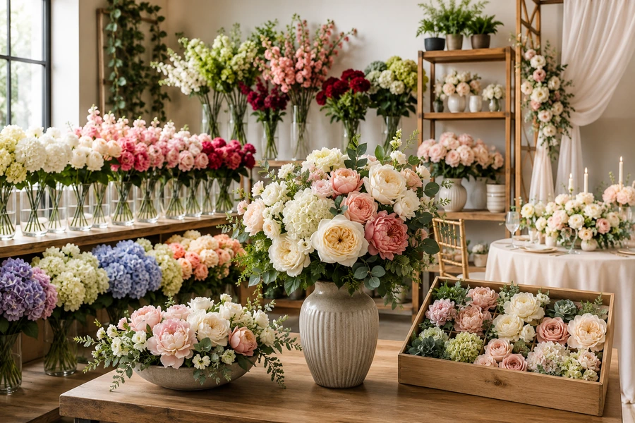
A beautiful display attracts attention, but an effective display also answers practical questions. Buyers need to see the flower size, color, texture, stem length, and possible application within a few seconds.
How Do You Make Artificial Flowers Look Real?
Realistic styling begins before the flowers enter a vase. Each flower head, leaf, and branch should be opened and shaped by hand.
Artificial flowers look more natural when their stems are bent into different positions, their leaves face several directions, and their blooms sit at varied heights. A limited color palette, visible greenery, natural spacing, and carefully selected containers also prevent the arrangement from looking artificial or mass-produced.
High-quality artificial flowers usually have detailed petals, secure foliage, and strong wire stems. Real-touch materials and layered fabric petals can also create a more lifelike finish. However, even a well-made artificial flower can look unrealistic when it remains compressed after shipping.
Shape Every Stem Separately
I start by separating the branches and leaves. I do not pull every part outward at the same angle. Natural plants grow toward light, compete for space, and develop small differences.
I bend some stems forward and let others move to the side. I keep a few blooms upright, while several blooms face slightly downward. This small variation gives the arrangement movement.
Use Controlled Imperfection
Perfect symmetry can make artificial flowers look manufactured. I prefer visual balance instead of exact duplication.
For example, I may place three large flowers on one side and two on the other. I then balance the heavier side with greenery or a longer branch. Grouping flowers in odd numbers and opening compressed stems are commonly recommended ways to create a more organic appearance.
| Styling element | Less realistic approach | More realistic approach |
|---|---|---|
| Stem height | Every stem is equal | Three or more height levels |
| Flower direction | Every bloom faces forward | Blooms face several directions |
| Color | Many unrelated bright colors | Two or three connected shades |
| Spacing | Every gap is filled | Small areas of negative space |
| Greenery | None or one repeated leaf | Mixed leaf shapes and lengths |
| Arrangement shape | Perfect round ball | Soft triangle or asymmetrical form |
Dust also affects realism. Artificial petals and leaves should be cleaned before they are placed under strong retail lighting. Damaged petals, loose leaves, visible glue, and exposed foam should be removed or hidden.
What Is the Best Way to Arrange Artificial Flowers?
There is no single arrangement shape for every product. The best structure depends on the flower type, container, viewing angle, and intended use.
A reliable artificial flower arrangement starts with structural greenery, followed by focal flowers, supporting flowers, and small fillers. The tallest stems establish the outline. Medium blooms create volume. Lower flowers connect the design to the container. Each layer should remain visible instead of competing for attention.
Build the Outer Shape First
I decide whether the arrangement will be viewed from the front or from every side.
A front-facing arrangement suits shelves, counters, arches, walls, and ceremony backdrops. It can have a flatter back because customers will not normally see that side.
An all-around arrangement works better on dining tables, reception desks, and central display islands. Its flowers should be distributed around the full container.
I place the tallest greenery first. These stems create the overall width and height. I then add the main flowers in a loose triangle. A low, slightly off-center focal bloom can create a natural visual anchor, while other focal flowers can repeat the triangular movement.
Work From Large to Small
A simple building order prevents the design from becoming crowded:
- Structural branches and greenery
- Large focal flowers
- Medium supporting flowers
- Small filler flowers
- Trailing or finishing stems
Large flowers need open space around their faces. Small fillers should connect gaps, but they should not cover the focal blooms.
Create Clear Flower Roles
| Flower role | Main purpose | Common examples |
|---|---|---|
| Structural stem | Defines height and direction | Eucalyptus, fern, willow, blossom branch |
| Focal flower | Attracts the eye first | Peony, rose, hydrangea, dahlia |
| Supporting flower | Adds rhythm and volume | Ranunculus, tulip, carnation |
| Filler flower | Connects visible gaps | Baby’s breath, waxflower, small berries |
| Trailing element | Softens the container edge | Ivy, wisteria, hanging amaranthus |
The finished arrangement should not feel full only because it contains many stems. It should feel complete because every stem has a clear job.
What Is the Right Vase-to-Flower Ratio?
An attractive flower can still look wrong in a poorly sized vase. Scale affects stability, realism, visibility, and perceived value.
As a practical starting point, the visible flowers can measure about one-and-a-half to two times the height of the vase. The ratio should change for wide bowls, tall floor vases, and low table centerpieces. The arrangement must also fit the surrounding space and viewing distance.
Some floral guides use a rule of thirds, while other designers recommend stems that rise about one-and-a-half times above the vessel. These rules are starting points rather than fixed laws.
Match the Vase Opening to the Stem Quantity
A narrow opening supports a small number of stems. It works well for tulips, long roses, blossom branches, and minimalist arrangements.
A wide opening needs more structure. Without internal support, the stems may fall toward the outside and leave an empty center.
For artificial flowers, I use floral foam, a wire grid, internal tape, or bundled stems when the vase opening is too wide. The support should remain hidden from normal viewing angles.
Adjust the Ratio for Each Application
| Display type | Useful starting proportion | Main concern |
|---|---|---|
| Bud vase | One to three stems | Keep the shape simple |
| Standard table vase | Flowers 1.5–2 times the vase height | Maintain balance |
| Low centerpiece | Wide and low | Protect sightlines |
| Tall floor vase | Long vertical lines | Prevent tipping |
| Shelf arrangement | Compact and front-facing | Fit the shelf depth |
| Wedding aisle arrangement | Tall or outward-facing | Remain visible from a distance |
A large dining centerpiece should not block conversation. A store display should not hide the products behind it. A floor arrangement should not extend into the walking path.
I also consider visual weight. Hydrangeas, peonies, and large roses appear heavier than narrow leaves or fine branches. A short arrangement made with large flower heads can feel more substantial than a taller arrangement made with thin stems.
How Should Artificial Flowers Be Displayed in a Shop?
Artificial flowers should be easy to see, compare, touch, remove, and return. A decorative display that prevents product access may attract attention but still create buying friction.
In a retail display, place hero arrangements at eye level, organize loose stems by clear visual categories, use several fixture heights, and keep the main path open. Show both individual stems and completed arrangements so buyers can compare products while also seeing how the flowers could look after purchase.
Retail merchandising guidance often recommends clear focal points, varied display heights, eye-level placement, open walkways, and layouts that follow normal customer movement.
Separate Inspiration From Inventory
I divide the display into two functions.
The inspiration area shows finished artificial flower arrangements. It communicates style, application, color combinations, and scale.
The inventory area holds the stems that customers can buy. It should be simpler and easier to restock.
When finished samples and loose stock are mixed without a system, customers may not know which items are available. They may also pull stems from the display model and damage the composition.
Organize Stems in a Buyer-Friendly Order
Artificial flower stems can be grouped by:
- Flower variety
- Main color
- Stem height
- Season
- Event type
- Price level
- Ready-made collection
Color blocking works well from a distance. Flower-type grouping works well for professional buyers who already know what they need. Occasion-based grouping helps customers who are shopping for weddings, parties, home décor, or seasonal displays.
Use Lighting to Reveal Texture
Soft, balanced light helps customers see petal texture and color differences. Strong light from only one direction can produce harsh shadows. It can also make shiny plastic leaves more visible.
Natural or diffused lighting normally presents floral colors more evenly than harsh direct light.
The display should be tested from the entrance, the main aisle, and close range. A layout that looks balanced from behind the counter may look crowded from the customer’s position.
My Insights: How to Style Artificial Flowers—9 Proven Layouts That Sell Fast
The most useful artificial flower layouts do more than make products attractive. They shorten the distance between seeing, understanding, and selecting the product.
Nine practical layouts are the color-block stem bar, height-tier pyramid, monochrome hero display, lifestyle vignette, occasion bundle station, centerpiece runway, vertical flower wall, grab-and-go bouquet grid, and seasonal story zone. Each layout solves a different buying problem and should be tested against actual sales data.
Product visibility is linked to stronger retail performance, but no display can guarantee fast sales. Price, product quality, demand, inventory, location, and customer service still matter. The goal of these layouts is to improve visibility, comparison, and decision-making.
1. The Color-Block Stem Bar
This layout places loose artificial flower stems in clear sections based on color families.
I may begin with white and cream, move into blush and pink, continue through red and burgundy, and finish with blue, purple, yellow, or green. Each block should contain several flower shapes and sizes.
The color-block stem bar works because buyers can start with a palette instead of searching through every flower variety. Wedding planners and interior designers often shop this way because the project color is already defined.
I keep the most popular shades near eye level. Long stems can sit in floor buckets, while shorter flowers can sit on raised shelves. I leave a small break between color families so similar shades do not blend into one large mass.
This layout is best for stores, trade-show booths, wholesale showrooms, and warehouse sample rooms.
2. The Height-Tier Pyramid
The height-tier pyramid uses a tall central element with medium-height products around it and low products at the front.
The layout creates a clear focal point. It also allows customers to see more products without placing every item at the same level. Retail display guidance commonly recommends varied heights and a focal product to guide the eye.
I use the top level for a dramatic arrangement or premium flower collection. The middle level can hold coordinated bouquets. The lowest level can hold loose stems, small potted flowers, or lower-priced add-on items.
The pyramid should not become a solid mountain of stock. I leave space around the hero arrangement and keep the lower products accessible.
This layout works well in windows, entrance displays, central retail islands, and exhibition booths.
3. The Monochrome Hero Display
A monochrome hero display focuses on one main color and uses several shades, textures, and flower types within that family.
For example, an all-white display may include ivory roses, cream hydrangeas, white orchids, pale greenery, ceramic containers, and light natural wood. A pink display may combine blush peonies, dusty rose stems, berry-toned accents, and muted eucalyptus.
The limited palette creates a strong visual identity. It also allows customers to notice differences in petal shape, flower size, and material quality.
I select one hero arrangement and support it with simpler products. The hero should be visible from the main customer approach. The surrounding items should frame it instead of competing with it.
This layout works well for new collections, premium products, wedding themes, and social-media-friendly store areas.
4. The Lifestyle Vignette
The lifestyle vignette shows artificial flowers inside a complete setting.
Instead of displaying a vase alone, I may place the arrangement beside a lamp, books, candles, tableware, or event décor. The setting shows scale and helps buyers imagine how the flowers could fit into a real room or occasion.
A home décor vignette may recreate a console table. A wedding vignette may show part of a reception table. A commercial vignette may present a reception desk, hotel lobby corner, or restaurant table.
The scene should remain focused on the flowers. Too many props can turn the display into decoration without a clear product.
I normally use one large flower product, one supporting floral item, and a few simple props. I also keep matching inventory nearby so buyers can move from inspiration to selection without searching elsewhere.
5. The Occasion Bundle Station
The occasion bundle station groups products by use rather than by flower type.
Possible sections include:
- Wedding ceremony
- Reception centerpiece
- Bridal shower
- Birthday party
- Hotel lobby
- Restaurant table
- Home entrance
- Seasonal window
Each section contains flowers that work together. It may include focal stems, greenery, fillers, ribbon, containers, or a completed reference arrangement.
This layout reduces decision pressure for buyers who know the event but do not know which flowers to combine. It can also support larger orders because the buyer sees a complete solution instead of one isolated stem.
I avoid creating bundles with too many fixed parts. Professional buyers may need flexibility. A clear “core set plus optional additions” structure works better than a single closed package.
6. The Centerpiece Runway
The centerpiece runway presents several completed arrangements in a straight visual sequence.
Each arrangement can represent a different size, price range, color palette, or event style. For example, the display may move from a small bud-vase set to a standard table centerpiece and then to a large statement design.
Customers can compare scale without relying only on written measurements. This is especially useful for event planners, restaurants, hotels, and wedding buyers.
I keep the table height consistent, but I vary the flower height. I also leave enough space between arrangements so each design has its own outline.
A comparison table can be placed nearby:
| Centerpiece size | Suggested use | Visual effect |
|---|---|---|
| Small | Cocktail tables and shelves | Light and simple |
| Medium | Dining and reception tables | Balanced and versatile |
| Large | Entrances and statement tables | Strong focal point |
| Long and low | Banquet tables | Continuous visual flow |
| Tall and narrow | Formal events | Dramatic without using table width |
7. The Vertical Flower Wall
A vertical display uses wall panels, grids, pegboards, arches, ladders, or tall shelving to show flowers above normal table height.
This layout is useful when floor space is limited. It can also create a strong visual feature that attracts attention from a distance. Retail event guidance recommends using vertical fixtures and risers to move products closer to eye level.
I use the upper section for lightweight completed pieces, wreaths, garlands, or cascading flowers. The central area holds key stems and bestsellers. The lower section holds heavier containers or extra inventory.
Products must remain secure and easy to remove. A customer should not need to pull one flower through several surrounding stems.
This layout works well for small shops, pop-up booths, wedding showrooms, and flower-wall product collections.
8. The Grab-and-Go Bouquet Grid
The grab-and-go bouquet grid displays ready-made artificial flower bundles in repeated rows or clear compartments.
Each bouquet should have a visible shape, price point, and color identity. The packaging should protect the flowers without hiding the petal texture.
I may organize the grid by small, medium, and large bouquets. Another option is to organize it by neutral, romantic, bright, seasonal, and modern styles.
The strongest products should sit near eye level. Lower-cost add-on bouquets can sit near the checkout area, where every customer passes. Checkout is an important merchandising zone because it naturally receives customer traffic.
The grid must remain full enough to look intentional, but it should not be packed so tightly that removing one bouquet damages the others.
9. The Seasonal Story Zone
The seasonal story zone creates one complete display around a clear time, event, or mood.
Spring may use blossom branches, tulips, soft greens, and light containers. Summer may use bright garden flowers. Autumn may use rust, amber, burgundy, berries, and textured leaves. Winter may use white flowers, evergreen foliage, metallic details, or deep red accents.
The display should change before it becomes visually familiar. Even a small update can make existing products feel new. I can keep a neutral base and replace the seasonal focal flowers, props, and front-facing products.
A seasonal display should also connect to available stock. A beautiful theme can frustrate customers when the main products are unavailable.
Retail merchandising guidance recommends refreshing displays when new inventory arrives or when the season changes.
How Can You Choose the Right Layout?
The best layout depends on the customer’s main question.
| Customer question | Recommended layout |
|---|---|
| “Which colors match my project?” | Color-block stem bar |
| “What are your best products?” | Height-tier pyramid |
| “Can I create a premium look?” | Monochrome hero display |
| “How will this look in a real space?” | Lifestyle vignette |
| “What do I need for my event?” | Occasion bundle station |
| “Which centerpiece size should I order?” | Centerpiece runway |
| “How can I browse in a small space?” | Vertical flower wall |
| “Can I buy a finished bouquet?” | Grab-and-go bouquet grid |
| “What is suitable for this season?” | Seasonal story zone |
I do not judge a layout only by appearance. I also track which stems customers touch, which products they return to, which combinations they buy, and which areas they ignore.
A layout can look impressive and still perform poorly. When customers repeatedly ask basic questions, the display may not be communicating clearly enough.
What Common Styling Mistakes Should You Avoid?
The most common mistake is displaying too much inventory at once. More products do not always create more choice. They can create visual noise.
I also avoid these problems:
- Using only one display height
- Placing every flower head at the same angle
- Combining too many strong colors
- Hiding premium products below eye level
- Mixing completed samples with sellable inventory
- Using undersized containers
- Leaving packaging damage visible
- Ignoring dust and loose threads
- Blocking the customer path
- Creating a display that cannot be restocked easily
A clean layout does not need to feel empty. It needs a clear order. Every product group should have a reason for its position.
Conclusion
Artificial flowers sell more effectively when the layout creates realism, clear comparison, easy access, and a strong finished vision without overwhelming the buyer.